StudyFind

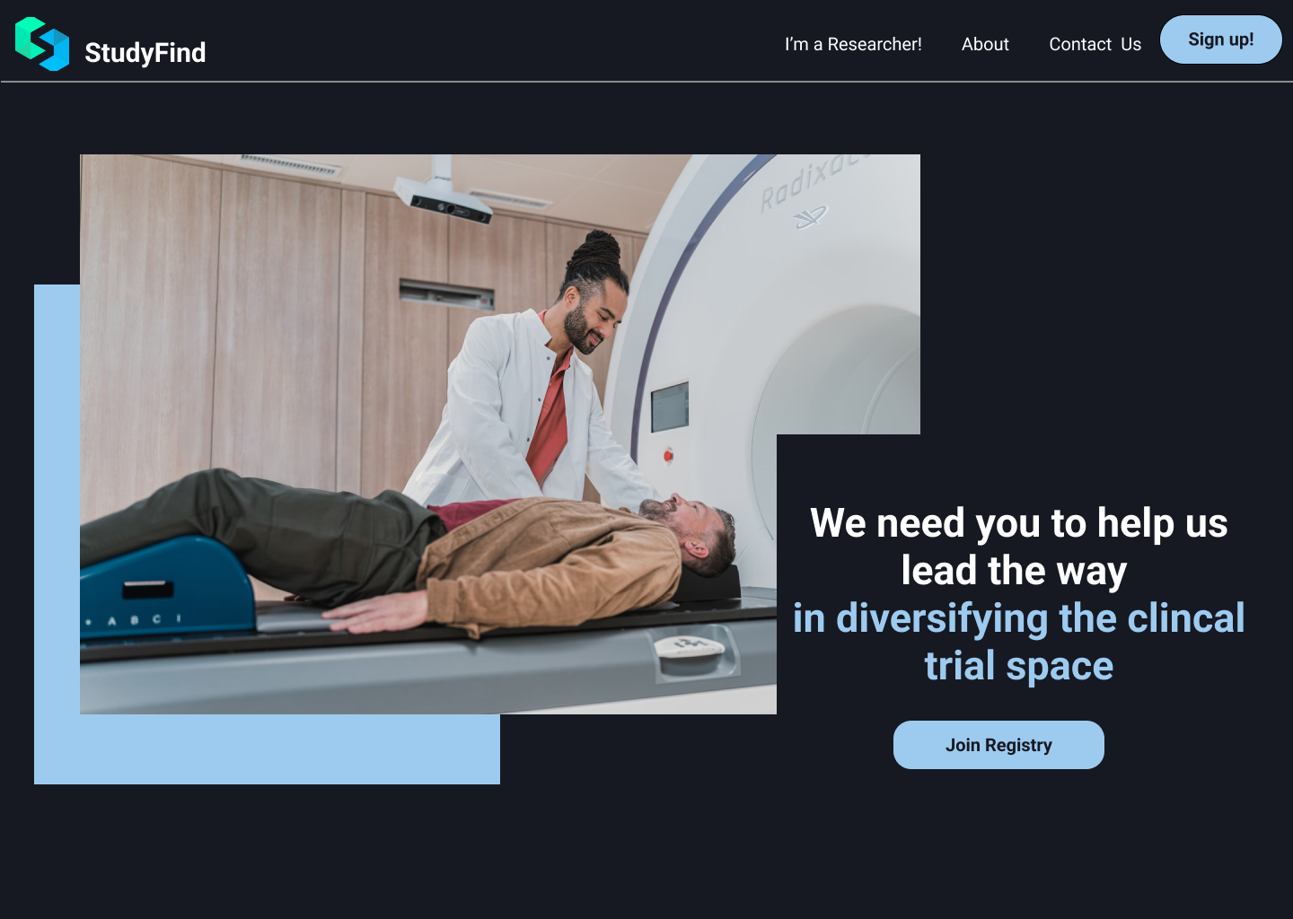
The redesign for the website of a company looking to increase the diversity and accessibility of participants in clinical trials.

Role

Lead UX Designer, Researcher, User Testing

Duration

12 weeks
Oct 2022 - Jan 2023

Tools

Figma, FigJam

Team

UX/UI Team
Michelle

VIEW CASE STUDY ↓
OVERVIEW RESEARCH IDEATION PROTOTYPING REFLECTION

Overview

What is a StudyFind?

Imagine you're a brilliant researcher, tirelessly working towards finding a cure for AIDS. But the real challenge? Finding a sample of willing and diverse participants for your trial. Despite plastering flyers everywhere, you're hitting a brick wall. Then your friend tells you about StudyFind, a registry of pre-screened pre-screened, handpicked participants eagerly await to join your study. But, StudyFind offers more than just a registry. Say goodbye to recruitment headaches and hello to seamless communication, progress tracking, and collaboration tools. It's like a dream come true for researchers on a mission to make a difference!

What's The Problem?

Researchers need fast way to recruit participants that have been pre-screened to fit the needs of their trial while also providing a way to easily communicate with them and get in touch with them. 

However, there was a problem to the problem, and that was that StudyFind did not have enough participants in their registry to attract researchers

Current Pain Points

  • Difficult site navigation
  • Hard to figure out what exactly studyfind does
  • Geared toward researchers and does not attract participants

So what's the cure?

A website that would attract not only researchers but also participants to join the registry. It would cater to all the needs of the researchers, while encouraging participants to join and making it accessible to all. 

Research

Let's find what StudyFind is about?

To get a better understanding of how to achieve a functional and user friendly website, I talked with the CEO of the company to get a better uderstanding of his vision and what hopes he has for his company and his website. After, this is what I gathered were the most important aspects to consider.

    In effort to diversify clinal trials!

  • Cater the website to both particpants and researchers
  • Easy access to to the registry surveys
  • Advertisement of what Studyfind does and why it's important

So how do we find more participants?

The bigger challenege in designing the website was figuring out how exactly to get more participants to join the registry in the website. Students are usually make up a signifcant portion of research trials, specifically when research takes place at colleges. So I went to the best place to find students, my university! In doing so, I tested the website with several students at my college to their feedback on the current website. I asked them to rate their experience of the site, followed by some user testing on the original website to see what students found difficult to navigate. This is where students had difficulties:

Finding Registries

49%

Navigating To The About Us Page

81%

Figuring Out How To Sign Up

34%

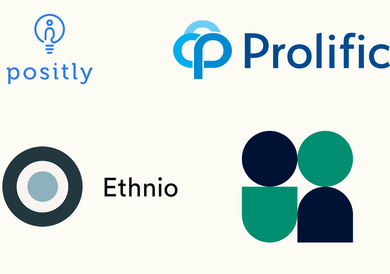
To further my knowledge in the components necessary for an accesible website, I looked at other participant recruitment sites. The main ones I looked at were userinterviews.com, positly.com, findparticpants.com, and prolific.com.

One major issue I found in almost all of these sites was cognitive overload. 3 out of the 4 homepages had an enourmous amount of information just on the hero's that I feel like most user would find it diffucult to take in. This lead to me to take approach a more minimlasitic approach with the website. One thing I did enjoy, while looking at these sites is that some contained friendly animations, which I found to be much easier on the eyes and for users to digest. Therefore, I decieded to take a similar approach and include illustrations rather than pictures in my redesign of the website.

Ideation

Wireframe

Based on our collective feedback, we formulated a clear vision for the desired appearance of the website. To initiate the redesign process, we commenced by restructuring the site's architecture to create a more orderly and polished website. Our objective was to ensure user-friendly and accessible navigation, while preserving the core principles and values of the website.

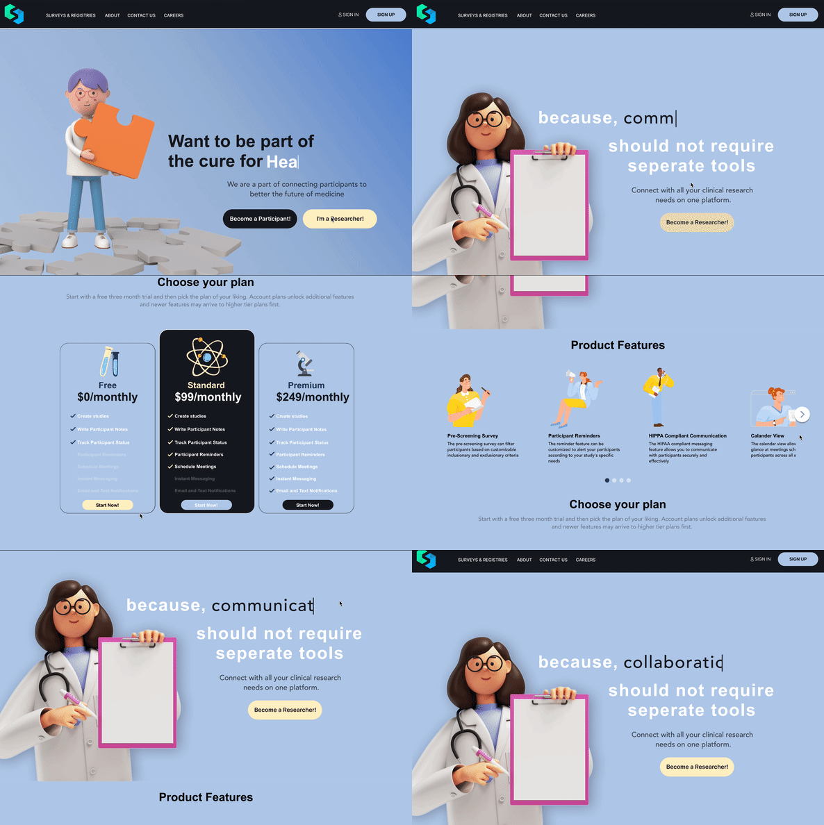
After creating the wireframe, I then played around with the overall branding of the site. Looking back to the competitive analysis I decided to go with something more light and minimalist to create a simple, yet inviting feel to website. With this, I decided to go with a light blue theme, and contrasting many of the buttons with yellow as a complimentary color. This will invite many users into a calming enviroment, and the color yellow promote a more playful tone. Furthemore, I chose two Sans-Serif font's to compliment each other in the headings and sub-headings, that also promote the minimalistic feel. Finally, I went with a 3d character theme to create an inviting space for both participants and users. I tried to stick with a researcher theme, by incorporating several 3d cartoon doctors.

Prototypes

First attempt to attract more participant

I developed the first prototype, without intially choosing to include 3d characters. This first prototyped aimed redo the navigation and archetitecture of the website, providing a more cohesive flow to all of the pages, and easier to acess to the log in and sign up setions. However this prototype failed to incorpoarte a welcoming feeling for many participants. In fact after several user interviews for just the hero's page, many people did not really understand what StudyFind was about.

The final version

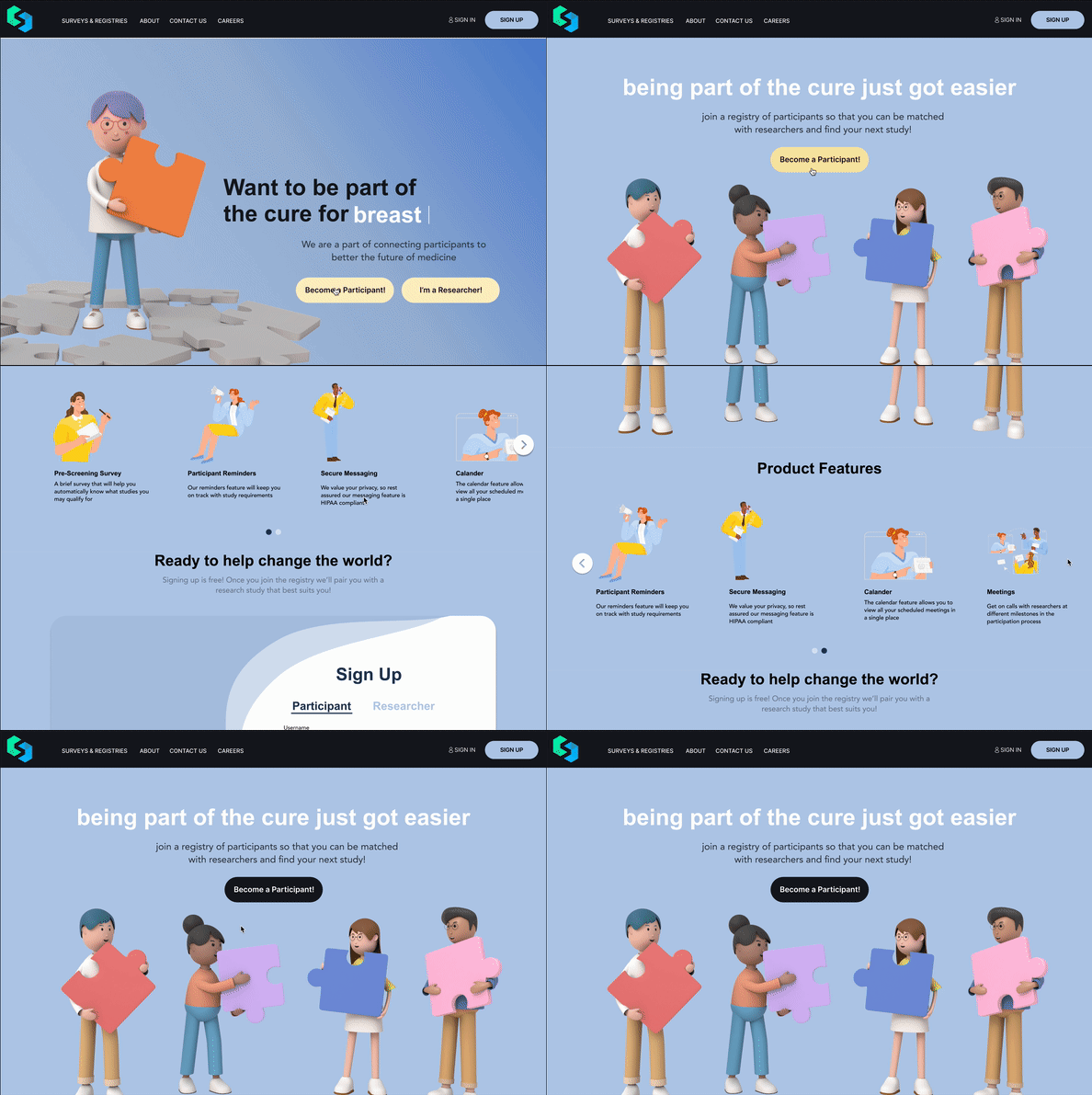
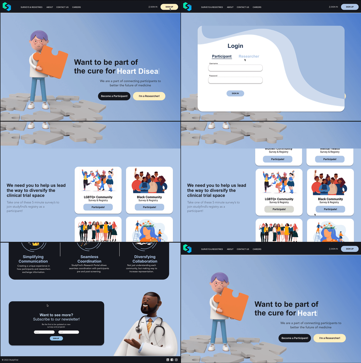
A final version of this prototype included a whole new rebrand, using 3d characters as well as as lighter and more playful colors (blue and yellow), to show participants that being in reserach trials can be a fun experience! I tried to use the 3d characters as metaphors or analogies, such as the puzzle piece character on the homepage to demonstrate that participants are the missing puzzle piece to creating cures, and expanding our knowledge. Furthermore, I made findign registries much easier, as it is found right on the page below the hero's page. This way the website caters primarily to participants while still advertising to researchers as well. Overall, I feel like this version of the prototype has a much smoother flow and allows users to easily understand understand what StudyFind is about and it allows for user to easily join the registry of particpants.

Reflection

I’m sure almost all of us have visited some coffee shops website’s in the past and we all have our assumptions on what would be better. But the process of redesigning and creating the new website for the Humble Bean Cafe really taught us that no matter how well you think you designed something, it will not the best design until truly tested. 

This projected helped me understand how important it is to work with users and how vital user testing and research is to the design process. It helped it pay attention to the most meticulous aspects of the design while trying create something user friendly for all users