HUMBLE BEAN CAFE

The redesign for the website of this charming and intimate coffee shop, that creates a welcoming atmosphere with its rich coffee and warm energy.

Role

UX Designer, Researcher, User Testing

Duration

11 weeks
Jan 2023 - Mar 2023

Tools

Figma, FigJam

Team

COGS187B UCSD
Michelle, Kimberly, Olivia

VIEW CASE STUDY ↓

Overview

Who is Humble Bean Cafe?

Have you ever considered why so many people choose to study at Coffee Shops? Is it because of the coffee? Maybe the food? Maybe they just need to get away from their roommates? Well, nestled in the heart of San Diego, The Humble Bean Cafe is a cozy Halaal cafe that provides a welcoming space for people to unwind for their own reasons. With a wide range of artisanal coffee and food options, the cafe strives to offer a comfortable spot for visitors to enjoy their coffee while working or catching up with friends.

What's the problem?

Students and professionals seeking to study or work at cafes face challenges in identifying cafes with suitable access hours, menu options, and interior ambience conducive to studying.

Current Pain Points

  • Unclear site architechture and hierarchy
  • No clear navigation menu
  • Can be difficult to find online ordering

Here's what we brewed!

A website that prioritizes the inside space, community and overall feel of the cafe rather than focusing solely on products. This would bring a unique perspective to all coffee goers as users would find themselves entranced not only by the coffee but by what Humble Bean Cafe has to offer as well.  

Research

A chat over coffee

To begin our process of the redesign, we spoke with the owner of Humble Bean Cafe, and discussed who his customers were as well as what features and fuctionality he was looking to add into his website. After a friendly conversation, we learned that Humble Bean is actually run by 3 brothers! And this is what they are looking for:

    What the client wants!

  • Cater to both tourists and San Diego locals
  • Easy online ordering, hours and navigation
  • Advertisement of the rewards program

Get a college students opinion

To figure out what really puts together a good coffee shop website, we interviewed several college students (the biggest coffee fanatics of them all) and figured out what exactly curates the best website. In the interviews we sat down with several students, some who have been to the Humble Bean Cafe before and some who haven't. My group and I compiled a set of distinct questions ranging from what their favorite coffee shop was and why, and what coffee website was their best and why. This helped us develop a well rounded understanding of what students really looked for in Coffee Shop Websites.

Interviewees

30

Humble Bean Customers

11

Non-Humble Bean Customers

19

After gathering the necessary research for the redesign of the Humble Bean Website, I discovered that students place high importance on fast online ordering, convenient access to operating hours and location mapping. Additionally, students who enjoy studying at cafes expressed the significance of having galleries or visual representations of the interior as an integral part of their experience.

Ideation

Wireframe and Site Architecture

Based on our collective feedback, we formulated a clear vision for the desired appearance of the website. To initiate the redesign process, we commenced by restructuring the site's architecture to create a more orderly and polished website. Our objective was to ensure user-friendly and accessible navigation, while preserving the core principles and values of the website.

Furthermore, we developed a low-fidelity wireframe that catered to the requirements of both the clients and the users. This wireframe specifically emphasized the three key elements previously mentioned: seamless online ordering, convenient access to operating hours and location mapping and advertisement of the rewards program.

Here is a closer look at our wireframe in comparison to the homepage!

Prototypes

A first look at a working prototype

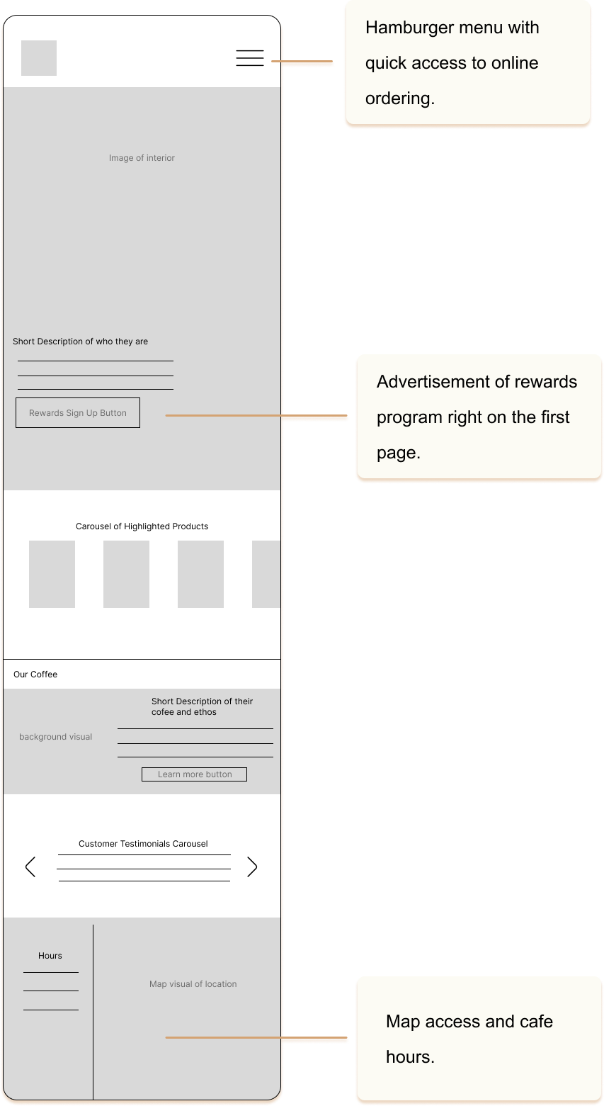
Subsequently, we developed our initial prototype, aiming to capture the essence of a café atmosphere. To achieve this, we incorporated header images throughout the pages, creating a visually appealing café ambiance. On the homepage, we included a compact product carousel to showcase their popular items. Additionally, a concise "About" section was integrated, providing an option to learn more and directing users to an "About Us" page. To enhance the café's credibility, we 
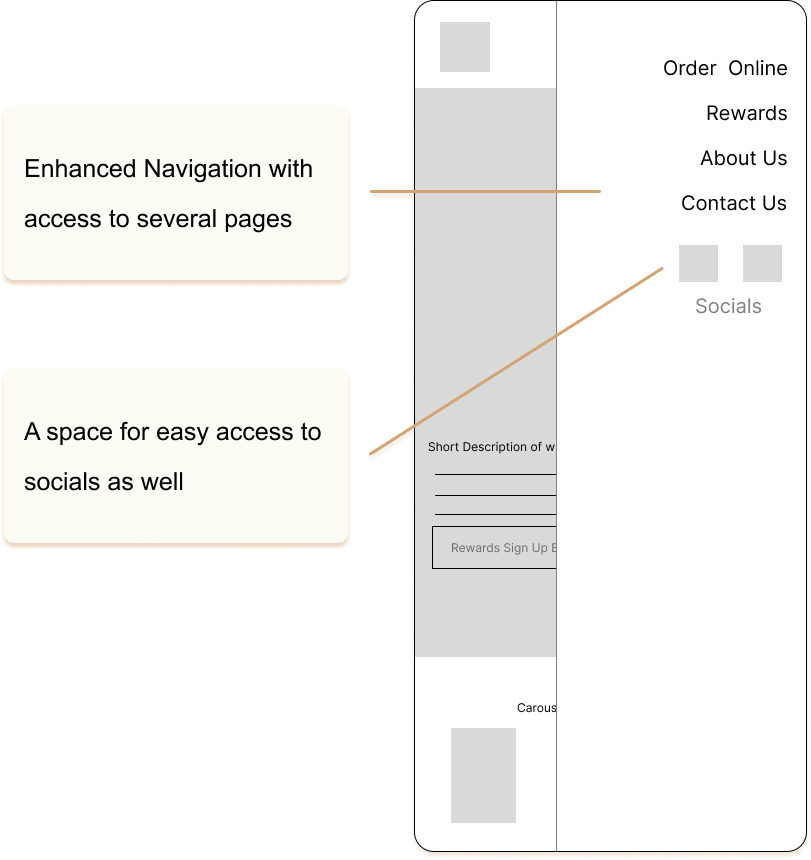
incorporated customer testimonials. Finally, we redesigned the navigation bar entirely, giving it a more seamless and aesthetically pleasing appearance compared to the original website.

1

In this prototype, we replaced the rewards button in the initial wireframe with the order online button, enhancing convenient access to the online ordering menu. Additionally, we relocated the location and hours information from the bottom of the homepage to the hamburger menu's bottom. This adjustment enables users to swiftly and effectively locate the hours and location without the need to scroll to the very bottom.

A second attempt

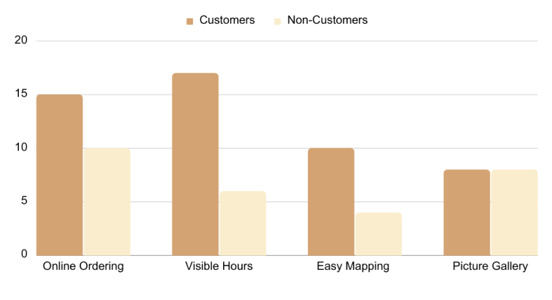
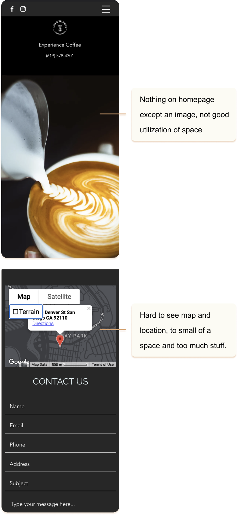
Following the initial prototype, we conducted user tests to assess its effectiveness. The results of these tests unveiled valuable insights regarding what aspects were successful and what needed improvement. Many users expressed their satisfaction with the website's layout, finding it significantly more navigable compared to other coffee shop websites they had visited. They particularly appreciated the distinctive placement of the hours and maps, considering it a 
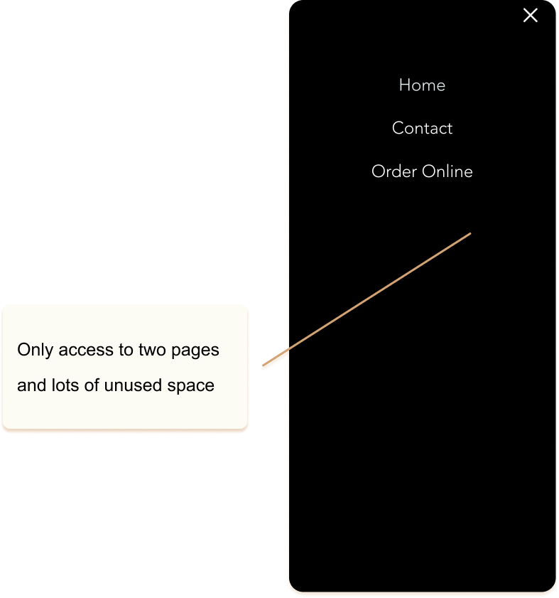
unique and user-friendly feature. However, some users found the about us page and rewards page somewhat confusing and suggested that these areas require adjustments for better clarity.

2

Based on the findings from the second prototype, we made several modifications to enhance the user experience. Firstly, we redesigned the layout of the about us page, making it more intuitive and visually appealing. This involved improving its comprehensibility and streamlining the overall design. Additionally, we revamped the rewards page by incorporating cohesive illustrations and utilizing bulleted text, resulting in a more visually coherent presentation.
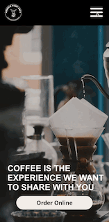
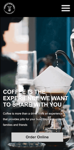
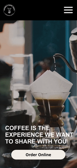
Our final version

We did our final revions for the prototype and here is what we came up with. A clean and functional website that covers easy online ordering, navigation to hours and the map, a rewards system and even a gallery filled with photos I took at the cafe. We added a bigger footer at the bottom that also contains the hours and also a link to get directions to the cafe. Finally, we also replaced the photos in the site with photos from the actually cafe giving it a more authentic and inviting feel.

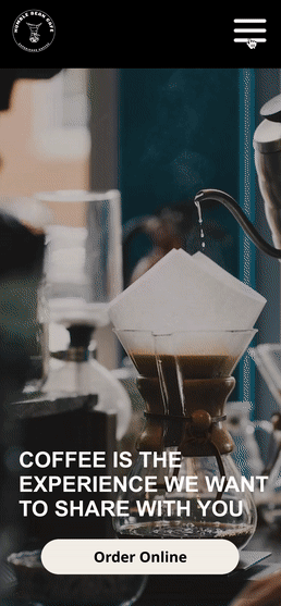
A simple yet invitng homepage to showcase the warm energy that the Humble Bean Cafe brings, while also incorporating easy access to online ordering, hours and location.

An about us page with actual pictures of the cafe, the ingrediants used and a heartwarming paragraph about who they are.

A sort and sweet rewards page letting you sign up for rewards and letting you know how it works and what the benefits are.

Reflection

I’m sure almost all of us have visited some coffee shops website’s in the past and we all have our assumptions on what would be better. But the process of redesigning and creating the new website for the Humble Bean Cafe really taught us that no matter how well you think you designed something, it will not the best design until truly tested. 

This projected helped me understand how important it is to work with users and how vital user testing and research is to the design process. It helped me pay attention to the most meticulous aspects of the design while trying create something user friendly for all users.

More Projects